Logo drafts / rev A
Logo directions for CADLORD
Round 3 (G–L, newest) first, then round 1 (A, B) and round 2 (C–F). A and B use the same wordmark — CADLORD set in Archivo Expanded Bold, converted to outlines (the logo does not depend on installed fonts) — and the same palette: drawing-ink black, paper white and one strong signal green. No crowns, no “lord” clichés; the references come from technical drawing.
Round 3 / 8 Oct 2026 · newest
Six ideas built on the letter C: G – L
More creative directions, all playing with the C, in the light industrial palette of the site (graphite, steel blue, safety orange) and shown on dark as well. Where the mark reads clearly as a letter, a second lock-up uses it as the C of CADLORD. Rounds 1 and 2 follow below.
G — Compass arc ✓ Selected for the website
The C as an arc drawn with a compass, construction left visible: centre mark, radius line and the dashed rest of the circle. The letter shows how it was made — the way an engineer thinks.



 CADLORD — The CAD Productivity Platform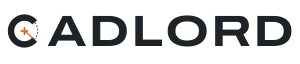
H — Spanner
The C is the head of an open-end spanner gripping an orange nut. A tool that holds a part: instantly “tools”, and still clearly a C.



 CADLORD — The CAD Productivity Platform
I — C-channel
The C as a rolled steel C-profile in isometric view, cross-section in safety orange. Industrial, three-dimensional, and the profile itself is the letter.



 CADLORD — The CAD Productivity Platform
J — Gear
A gear with a missing segment forms the C; the gap is marked like a cut, the centre with a centre mark. Machinery and productivity in one sign.



 CADLORD — The CAD Productivity Platform
K — Spline
The C drawn as a CAD spline with its control points and tangent handles — the moment of designing a curve. Light and precise; the handles disappear at small sizes, leaving a clean C.



 CADLORD — The CAD Productivity Platform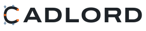
L — Click
A squared, bold C with a cursor clicking inside its opening — one click instead of repetitive work. The boldest, most “product-like” direction.



 CADLORD — The CAD Productivity Platform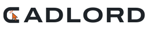
Rounds 1 & 2 / earlier
A — Isometric bracket
An L-shaped bracket in isometric view — the classic first part every CAD user models. It reads as the “L” of CADLORD, shows real 3D geometry, and carries hidden-line dashes like a proper drawing. Works as an app icon and animates well (the landing page draws it line by line). Used on the landing page.

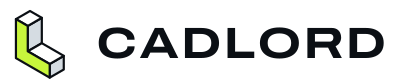


B — Centre mark & datum
Monogram CL from drawing symbols: the C is a circle with a centre mark, the L is a datum corner with extension lines. In the wordmark the O becomes a centre mark and a dimension line spans the whole name. More typographic and calmer; better for documents, invoices and small print.


Round 2 / 8 Oct 2026
Four new directions: C, D, E, F
Each one built on a different idea. Favicons shown at real size — 64, 32 and 16 px — and in a browser-tab mock-up.
C — Constructed wordmark
No symbol — the name itself is the logo. Letters are built from straight lines and tangent arcs like a constrained CAD sketch. The O is a cross-section with hatching, the crossbar of the A is a dimension line with arrows. Favicon: the hatched section on its own.



 CADLORD — CAD Tools CADLORD
D — XYZ triad
The coordinate system every CAD user sees in the corner of the viewport: three isometric axes, the Z axis in signal green, origin as a tiny hexagon (a cube seen corner-on). Clean geometry that stays readable down to 16 px.



 CADLORD — CAD Tools CADLORD
E — Isometric app tile
The monogram CL on one isometric block: C on the left face, L on the right, signal-green top. Packed into a rounded tile so it works as an app icon, avatar and favicon — the silhouette stays clear even at 16 px.



 CADLORD — CAD Tools CADLORD
F — Title block
The logo as the title block of an engineering drawing — the box every drawing is signed off in. CADLORD in the main field, “CAD tools / digital store” in the side cells, the green cell is the drawing-number field. Favicon: a drawing sheet with its title block.



 CADLORD — CAD Tools CADLORD
Fonts: Archivo and JetBrains Mono, both SIL Open Font License, self-hosted.